Optimizing Eventbrite's Waitlist Registration
This is a redesign of the waitlist experience for Eventbrite. Our goal was to increase waitlist conversion and improve waitlist throughput by updating the experience to enhance design affordance and adding mobile confirmation to drive throughput.

Free events pose a problem for organizers and people on the waitlist.
Registrants have no incentive to unreserve their seat(s) even if they do not intend to go. This affects organizers and the waitlisted. For organizers, that means unfilled seats. For people on the waitlist, that means they will not attend because of seating uncertainty.
Our goal is 1. to help organizers reduce no-shows and ensure accurate reservation counts. 2. to help people on the waitlist secure spots to the event.

But first. In 2025, Evenbrite did a branding refresh, hiring the design agency Buck, to develop new branding standards.
At the same time, Eventbrite refreshed their mobile application to reflect the new visual design scheme.

The mobile app reflects the latest visual design specifications, while the web application currently lags behind, adhering to the legacy color guide and visual design system. We took this opportunity to update the web application to align with the new visual system.

One of our goals is to optimize the user interface for action clarity: make it clear that users can still register to the event.
The deactivated quantity stepper and the 'Sold out' badge in the legacy version provide negative affordances for waitlisted users, signaling that no action can be taken. This directly conflicts with the 'Join waitlist' CTA, causing confusion in the user's attempt to register for the event.
The current layout also presents usability challenges. Users may not immediately understand the purpose of the right sidebar with the event image and empty cart (which is connected to the stepper). Additionally, the visual hierarchy doesn't clearly connect the sidebar image to the header's event information, impacting relational context.

We did a style refresh following the standards laid out by the new visual design scheme. We moved the event image next to the event information to increase relational understanding. We also removed the right sidebar to decrease visual noise.
We updated three key elements to motivate users to join the waitlist:
1. To improve clarity and encourage registration, we replaced 'Sold out' with 'Waitlist open' to signal ongoing availability.
2. We re-activated the quantity stepper to enhance user engagement with the waitlist registration flow and provide organizers with data for better waitlist management.
3. To the left of the 'Join waitlist' button, we implemented a dynamic line indicating the number of users ahead. This provides clear, real-time information to inform their decision to register. By positioning this visual cue within the button's immediate vicinity, we also aim to create a sense of activity and social proof.

Adding confirmation feedback
Confirmation feedback. Currently, after a user registers for the waitlist, it doesn't trigger a confirmation email about the action. As a result, many registrants report feeling their action wasn't recognized.
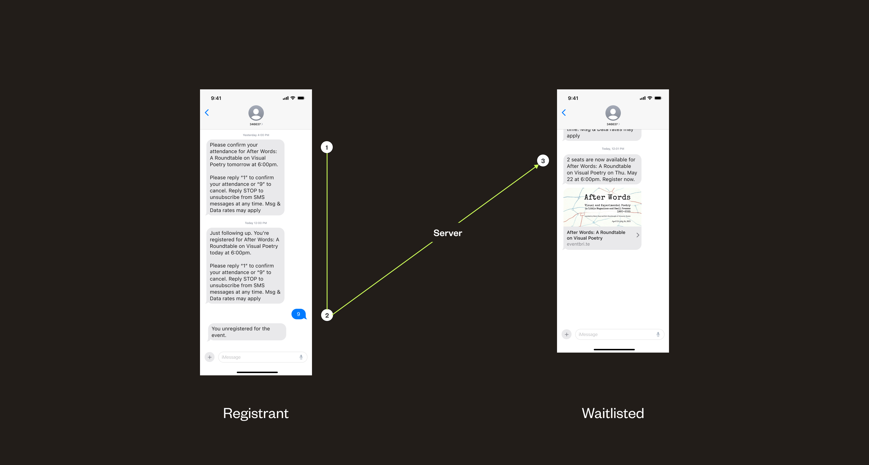
In our update, after the end of the registration process, users receive a confirmation notification on their phone.

Creating opportunities for waitlist conversion
Phone notifications. The current unregistration flow requires users to log in, navigate to their ticket, and then unregister. This multi-step process introduces significant friction. This is especially worse for free events because there's a lack of clear motivation or consequence for users to proactively unregister.
We implemented a mobile confirmation request to streamline the unregistration process, making it quick and easy for registrants to take action. We expect this to improve attendance data accuracy and increase waitlist conversion rates.
When a spot becomes available due to unregistration, the system immediately notifies the next user on the waitlist. The notification includes the event image for quick visual recognition and a direct prompt encouraging them to register.
Our next step is to validate the effectiveness of these new unregistration and waitlist notification flows.
Key questions we will be exploring are: What is the registrant response rate to the mobile confirmation requests? Does this lead to a noticeable increase in freed-up seats for events?
Additionally, we plan to A/B test the timing of confirmation notifications (e.g., one week versus two days prior to the event) to optimize registrant responsiveness. Finally, we'll be monitoring the conversion rate of waitlisted users when notified of an available spot.

To follow up on our design, because we already implemented the new style to the waitlist pages, we also took the opportunity to refresh the rest of the paid registration pages to adhere to the new visual design guidelines.

The previous right sidebar, intended as an Order summary, was causing visual confusion for users. To address this, we've introduced a dedicated button that triggers an Order summary overlay.